4/30/2008


4/29/2008

4/20/2008


4/18/2008
Mail - The Interpreters (by me)
Envelope
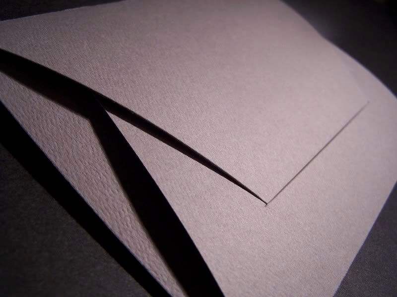
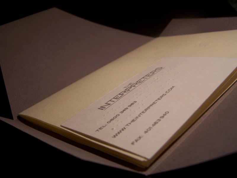
...which contains;
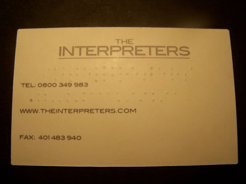
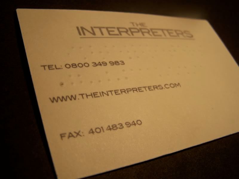
Business Card
Poster
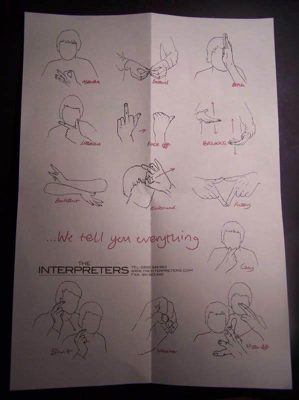
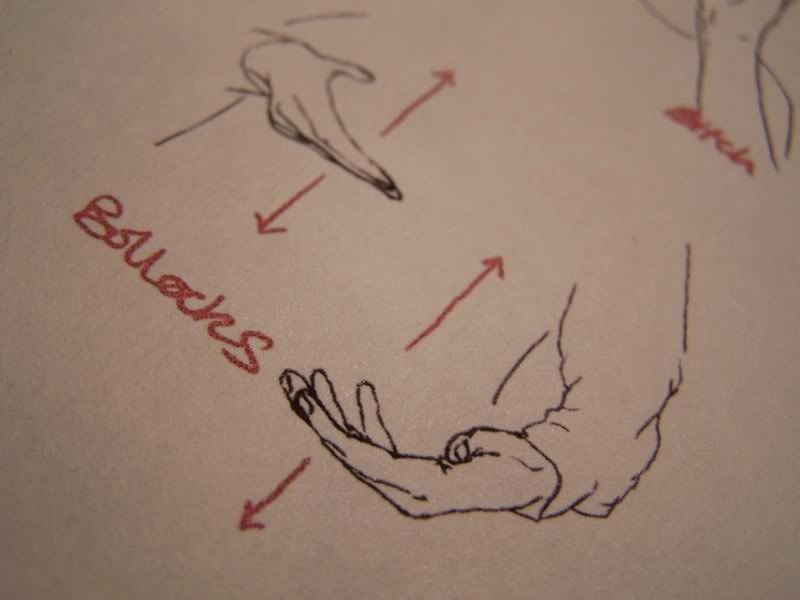
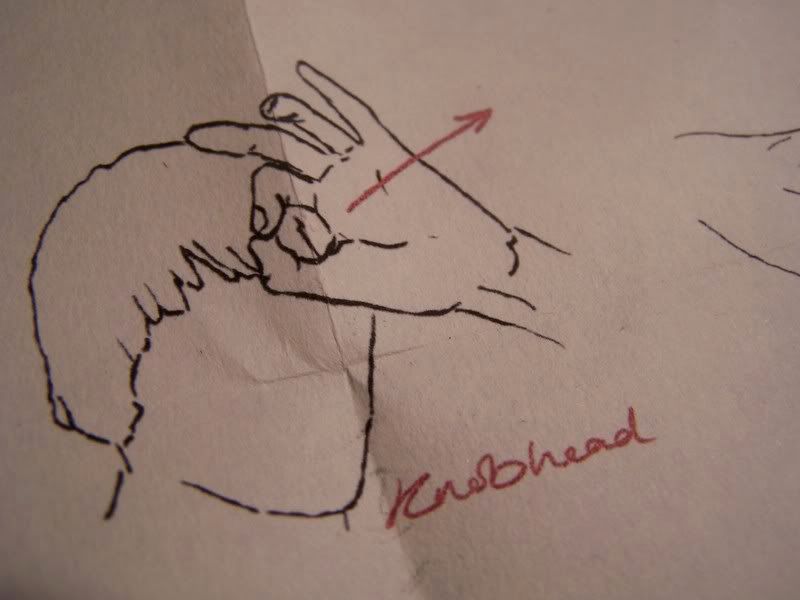
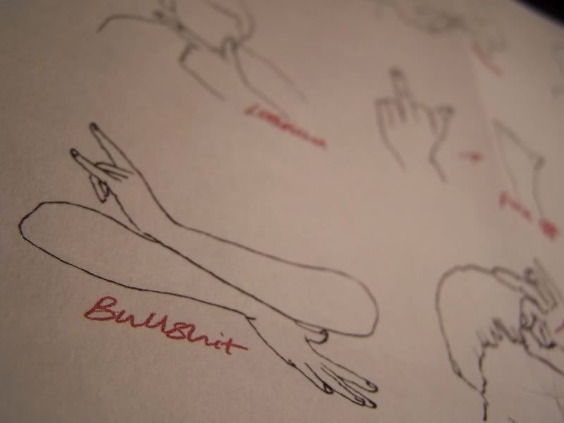
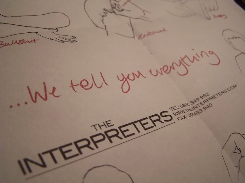
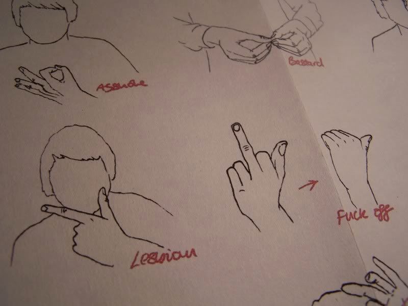
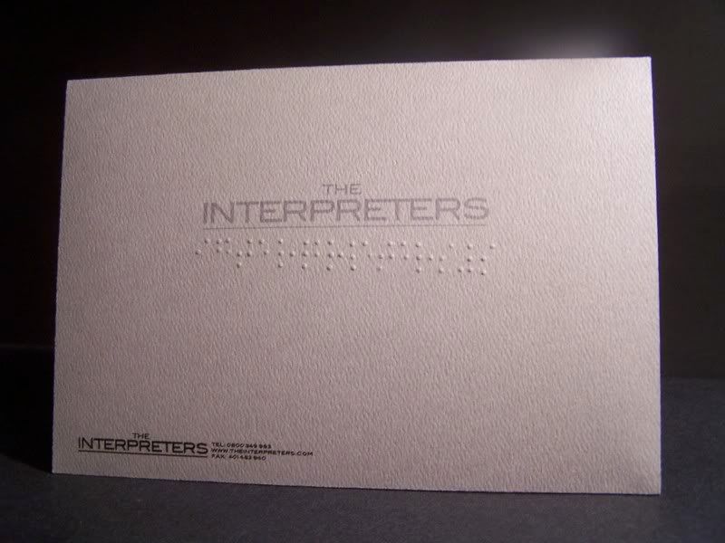
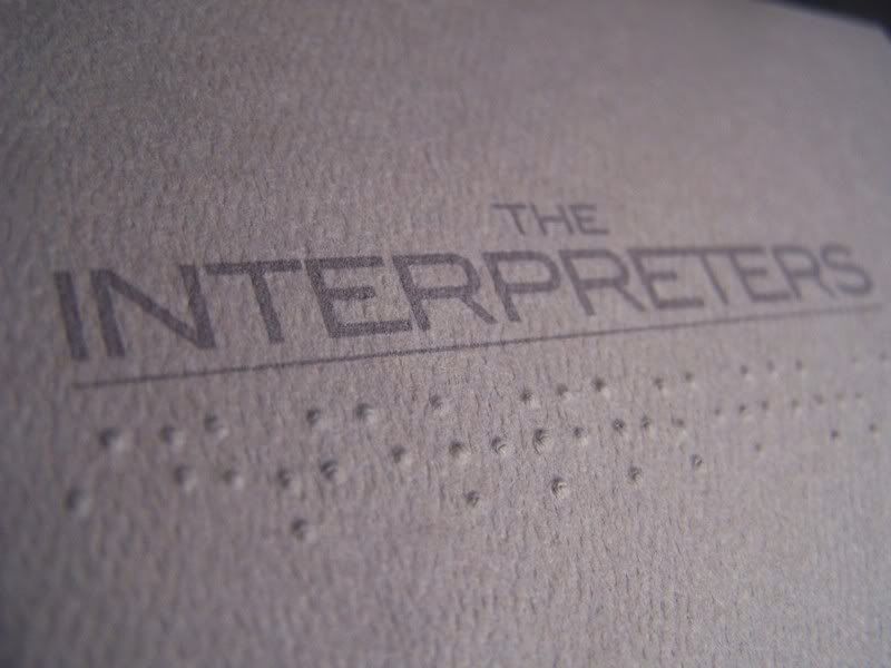
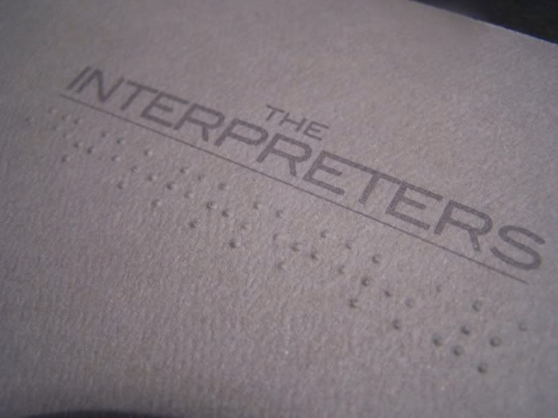
My final outcome is aimed at adults which have an experience in business, and may need the services of an interpreter. I chose a formal and proffessional design throughout the package, including humour and clever use of the companies services with the poster; to intrest the reader and thus gain more clients to the company. I also considered sight and hearing impaired persons through use of sign language illustrations for the poster and braille on the envelope and business card. The braille reads correct; the company name, and telephone number. The reader can then contact The Interpreters and inquire about our services in conversation. - I think these are two key elements to my outcome, they show the company covers a range of different translation, rather than the expected foreign languages...
- To improve the overall mail, i would state the fact that The Interpreters do translate foreign languages, something i somehow missed!


...which contains;
Business Card


Poster


My final outcome is aimed at adults which have an experience in business, and may need the services of an interpreter. I chose a formal and proffessional design throughout the package, including humour and clever use of the companies services with the poster; to intrest the reader and thus gain more clients to the company. I also considered sight and hearing impaired persons through use of sign language illustrations for the poster and braille on the envelope and business card. The braille reads correct; the company name, and telephone number. The reader can then contact The Interpreters and inquire about our services in conversation. - I think these are two key elements to my outcome, they show the company covers a range of different translation, rather than the expected foreign languages...
- To improve the overall mail, i would state the fact that The Interpreters do translate foreign languages, something i somehow missed!
4/17/2008


FLAG - Swiss Graphic Design


FLAG is a graphic design studio established in 2002 by Bastien Aubry (*1974) and
Dimitri Broquard (*1969) in Zurich, Switzerland. Since then FLAG is working essentially
for art and cultural projects such as catalogues, artists books, magazines and posters.
FLAG also does drawings, illustrations for editorials and private projects.
Both of them are teaching in different art schools in Switzerland.
Selected clients:
Addition & Adelaide, Tokyo
Hauser & Wirth Zurich London
Helmhaus Zurich
Neue Kunst Halle St. Gallen
Stadt Theater Bern
Swiss Institute, New York
Yomama Recordings, Hamburg
BonesMag...again.
This video is quite surreal, i found it weird as i couldn't label it with any meaning...
BonesMagazine.co.uk
Bones Magazine x Simon Gelifus from Bones Magazine on Vimeo.
Here's a video from 'Bones Magazine.co.uk'
They're a web-based magazine, which subscribers can download their monthly podcast from itunes for free. The videos are bursting with graphics, you don't really know where to look or what to focus on as things are moving constantly.. Their videos however, do portray a subject/emotion, this the 'hardcore' issue of the magazine.
I like the way they deliver their work, through podcasts and online reports, i think it suits the younger generation and is an insight into how design could be communicated in the future.
Stanley Donwood - Radiohead
Stanley Donwood has taken the role of designing and creating the album work for nearly all of the band Radioheads' records. I find his style of artwork really interesting, it's different and looks asif it has texture, when really its just flat graphics. He creates large scale images, which have a powerful content of dramatic buildings , mountains and landscapes. I like his use of mixed media and techniques, his works consist of; paint, digital & hand-generated illustration, photography, typography, and packaging design. 


4/15/2008
Typography - Stop motionfilming
 iLK™ | graphic design, illustration and art direction | free...
This film clip uses a creative technique using typography.
The creator used stop-motion filming; compiling a series of photographs to create a film.
I like how the type spreads and 'takes over' the woman's body. I think the black and white contrast works really well to produce a powerful piece of film.

4/14/2008
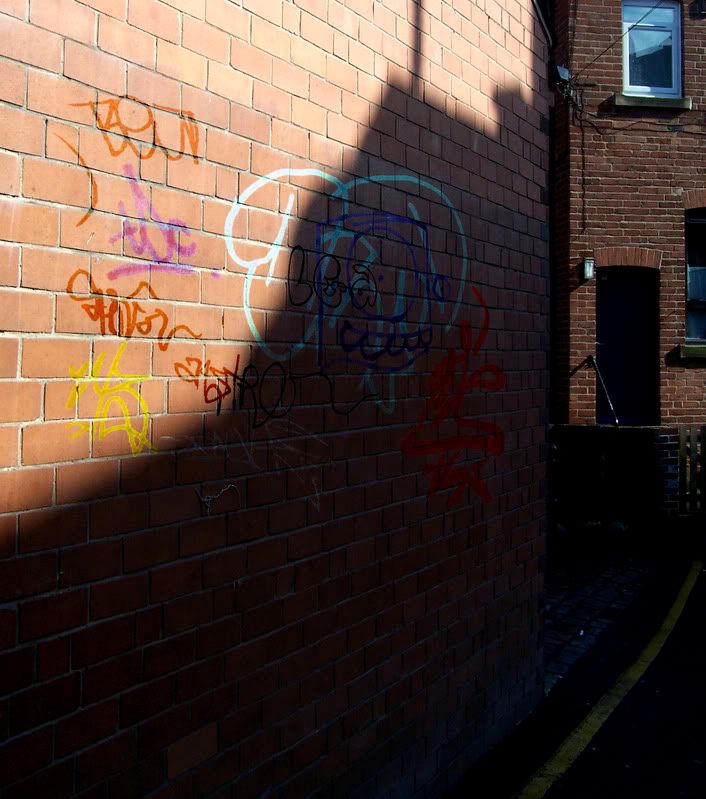
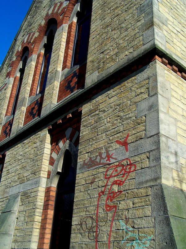
Photo Editing - Graffiti (by me)
I'v investigated the use of line within things we see everyday for my Visual Language work.
In these images i used several Photoshop techniques to add graffiti to a clean surface. A surface prime for graffiti.
Here are some examples...

In these images i used several Photoshop techniques to add graffiti to a clean surface. A surface prime for graffiti.
Here are some examples...


Subscribe to:
Posts (Atom)
